- Header
- Horizontal menu of categories
- Sliders
- Banners
- Category badges
- Display of product skus
- News block
- Footer
Header
Header consists of 3 elements:
- Fix menu.
- Menu of informational pages, applications and search field.
- Logo and blocks.
- Block 1.
- Logo.
- Block 2.

Each element can be changed in Theme settings.
Horizontal menu of categories
Types of horizontal menu
Dropdown menu:
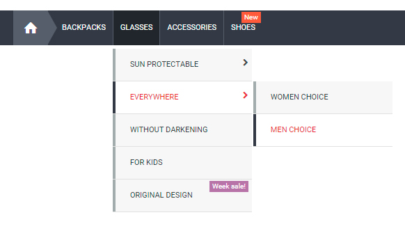
Vertical menu with dropdown categories list:
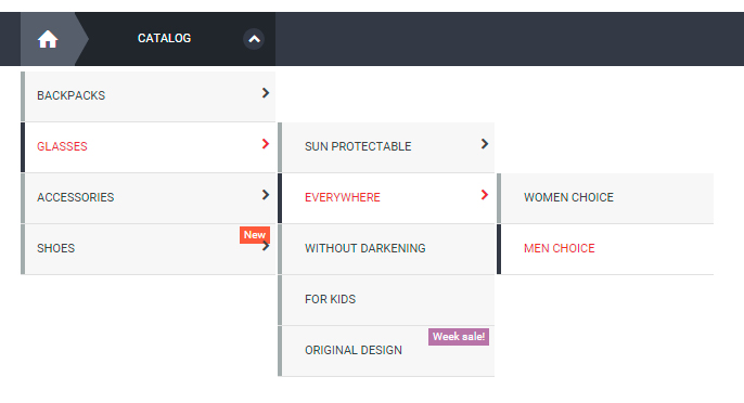
Vertical menu with dropdown menu categories:

Width of horizontal menu
Full width:

Limited:

Combine:

Content of horizontal menu
As the content of horizontal menu can be not only categories, but also:
- Pages of different applications.
- Brands tab (need plugin Brands)
- $wa->apps() menu (You can change it in Site - Settings - $wa->apps() menu)
Additional blocks in vertical menu with dropdown categories list
When you use "Vertical menu with dropdown categories list" you can add to the dropdown block some additional information.
Available parameters
- top_block - top part of the block;
- right_block - right part of the block;
- bottom_block - bottom part of the block.
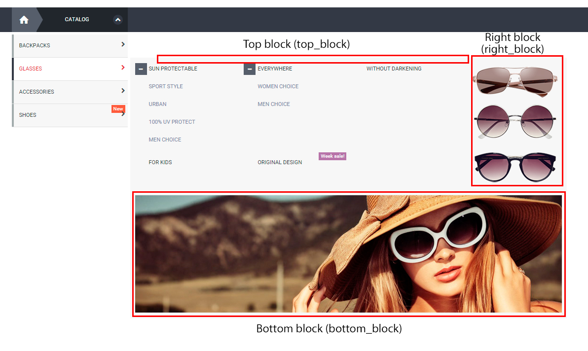
You need to:
-
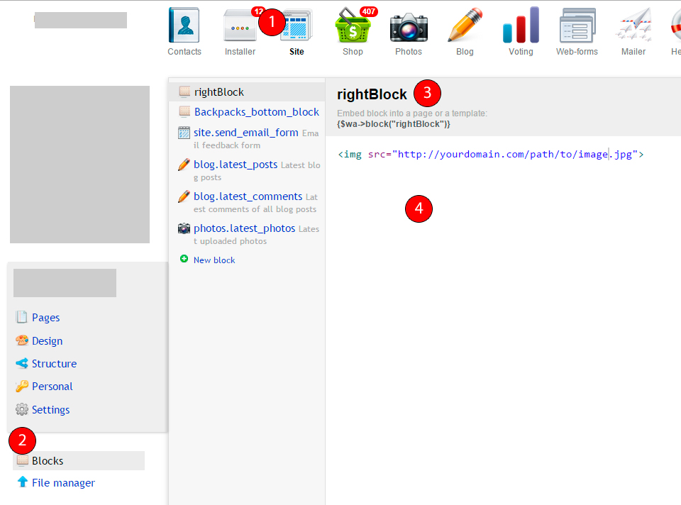
Go to "Site - Block", create block, remember the ID, add content.
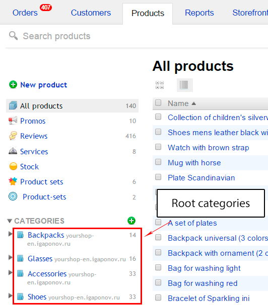
- In application "Shop - Products" choose root category, where you would like to output your block.
- In Additional parameters of category settings specify the place, where to output the block.

Sliders
Theme design "Yourshop" let you use sliders without any plugins or applications.
In Theme settings you can control all the sliders.
This paragraph will describe types of sliders and custom output.
There are 3 types of sliders:
- Products slider.
- Images slider (application Photos).
- Big products slider
Images slider
Slider uses free application "Photos".
Steps of creating the slider:
- Go to app "Photos", create album, specify "Manage access": "Private".
- Upload photos to the recent created album.
ATTENTION, photos should have "Manage access": "Public"! - If you would like to create slide with link to some page, you should print it (link) in the description of photo.
- Remember the ID of album.
- Insert slider to the template.
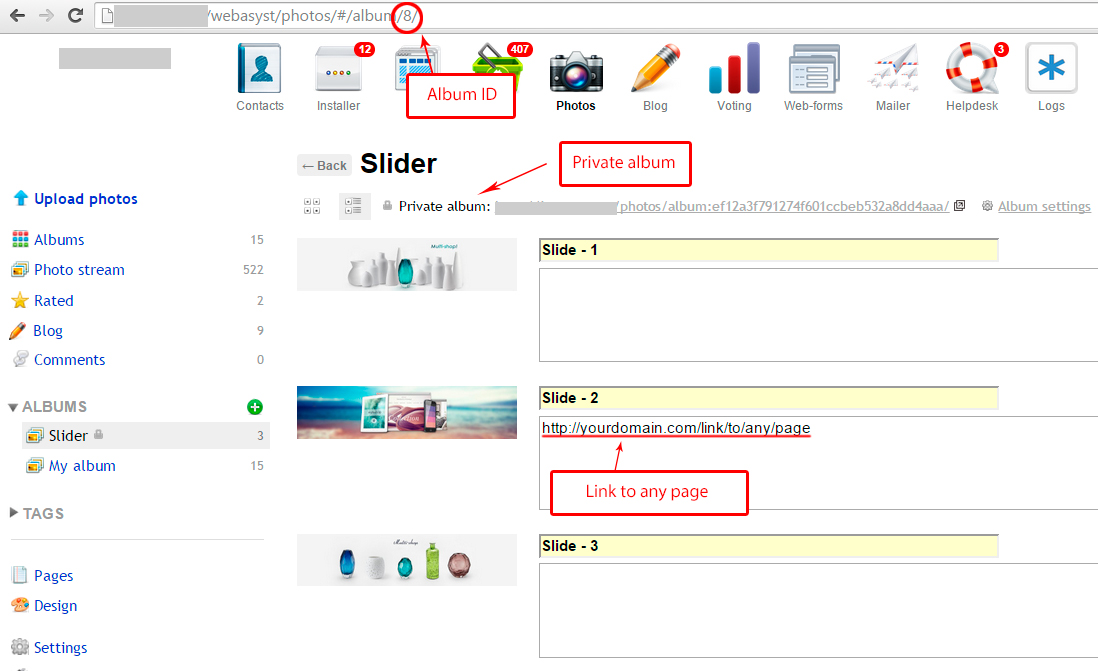
There are 2 modes of getting photos to slider:
- album/1 - list of photos from album with ID 1
- tag/jewellery - list of photos with tag jewellery
Use code for custom output:
{include file="slider.html" photos ="album/1"}
where
- photos ="album/1" - list of photos from album with ID 1. Field photos can contain "tag/jewellery"
By default, the slider automatically get the desired width of the image depending on the width of the container in which the slider is located. the width of the slides will not be more than the maximum available image size.
Available parameters:
- photos - mode of getting photos (required)
- search_count - quantity of photos
- width - width of photos. Check that the settings of application "Photos" are supported your maximum width. Also be sure that the application can create thumbnails on fly.
- height - height of photos
In "Theme settings" you can control sliders on the main page of app Shop.
Products slider
There are four modes of selection the products for slider:
- set/bestsellers - the list if products with ID bestsellers
- category/437 - the list of products from category with ID 437
- tag/jewellery - the list of products with tag jewellery
- prepared array
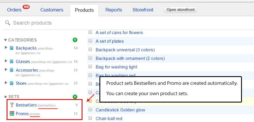
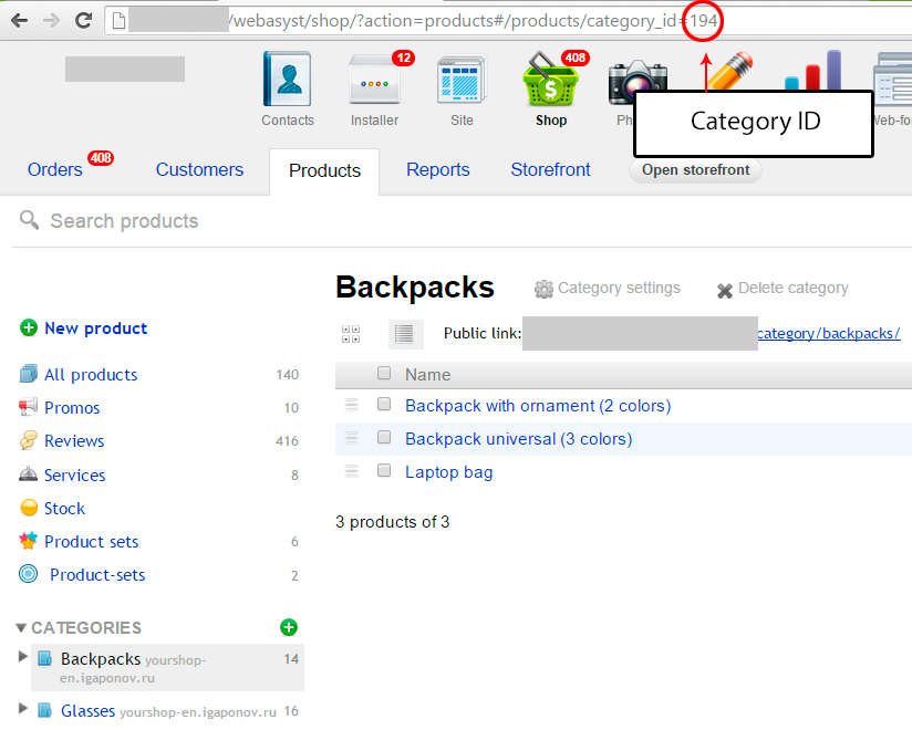
The first three modes have the same construction of calling:
{include file="slider.html" slider_id="12" search="set/bestsellers" search_count="7" name="Bestsellers"}
where
- file="slider.html" - required parameter that specifies the path to the template slider.
- slider_id="12" - required parameter that specifies slider ID. If you use more than one slider on page, parameters slider_id should be different.
ATTENTION! Use values for slider_id > 10 - search="set/bestsellers" - list of products with ID "bestsellers". The field search can have category/437 or tag/jewellery
- search_count="7" - number of products to get. Default value is 10
- name="Bestsellers" - title before slider.
 Prepared array means that you get products in template and passing them to slider. Example:
{$crossselling = $wa->shop->crossSelling()}
{include file="slider.html" slider_id=13 products=$crossselling}
where
- products=$crossselling - prepared array with products
Available parameters:
- slider_id - unique slider ID (required)
- search - mode of getting products (required)
- search_count - quantity to get
- name - title before slider
- auto - auto scroll. Available values: true, false.
- speed - scrolling speed (only when you use auto scroll). Measure in milliseconds
Example,
In Theme setting you can control two slider of products on main page of the Shop.
Big products slider
In Theme setting you can control Big products slider on main page of the Shop.

Slider uses product's info. Let's analyze each element:
- "Universal bag" - name of product;
- "High-quality demonstration of products, big photo size" - text of promo (more in Additional parameters below);
- "All products in our catalog have a clear..." - product summary;
- "Read more" - link to product's page
In Theme settings you can change the colors of slides.
Additional parameters
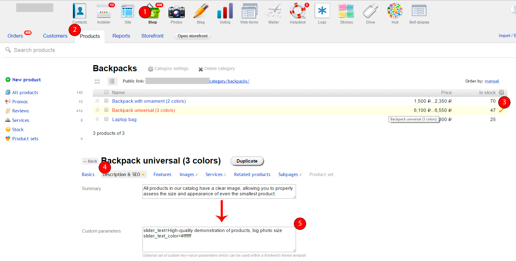
With the help of "Additional parameters" you can change the colors of each slide and also change the output information.
- slider_title - title of the slide;
- slider_text - promo text;
- slider_description - summary of slide;
- slider_url - link to redirect;
- slider_img - slide image;
- slider_button - button text (Read more);
- slider_title_color - color of title;
- slider_title_bottom_color - color of title bottom line;
- slider_rating_color - rating color;
- slider_text_color - color of promo text;
- slider_description_color - color of summary;
- slider_img_color - background color of image;
- slider_desc_color - background color of description block;
- slider_button_text_color - button text color;
- slider_button_bg_color - background color of button;
- slider_button_border_color - border button color
ATTENTION! Colors should be in HEX-format. Example, #ff0000.
See below the example of "Additional parameters". Each parameter should be specified in new row. Equals sign should not have spaces around.
Banners
There are 2 types of banners : with custom sizes (will be displayed in line) and with recommended values.
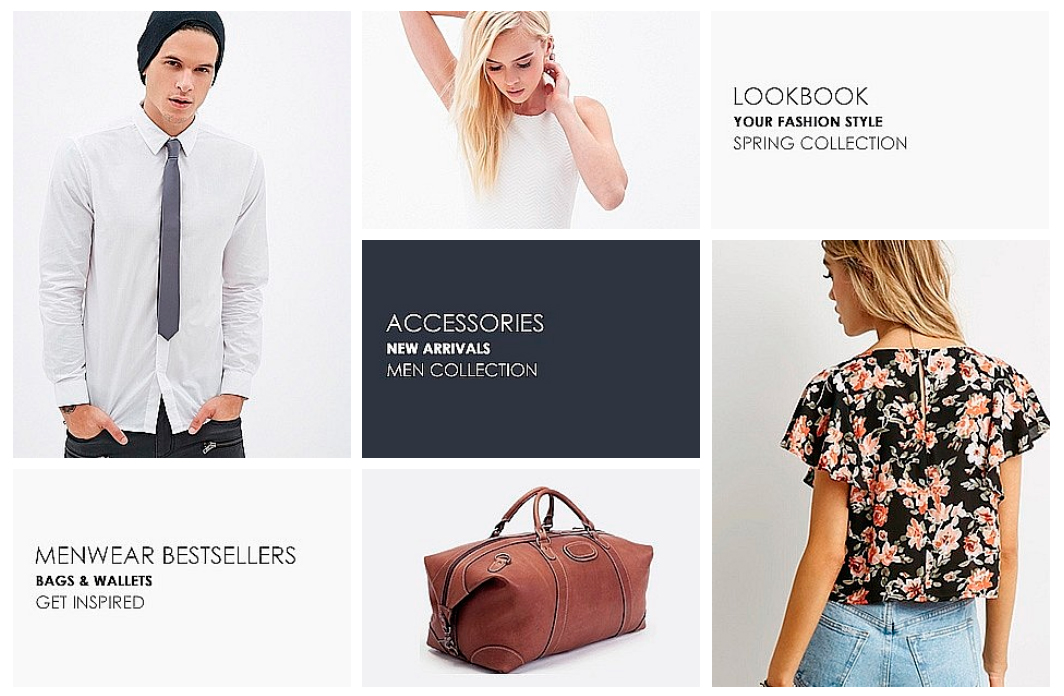
In Theme settings you can find recommended values for the banner's dimensions. You should:
- Go to application Photos.
- Create Private album.
- Upload 7 banners with recommended sizes. Photos should have "Manage access": "Public"!.
- Place the banners in order.
- Specify the album ID in Theme settings.
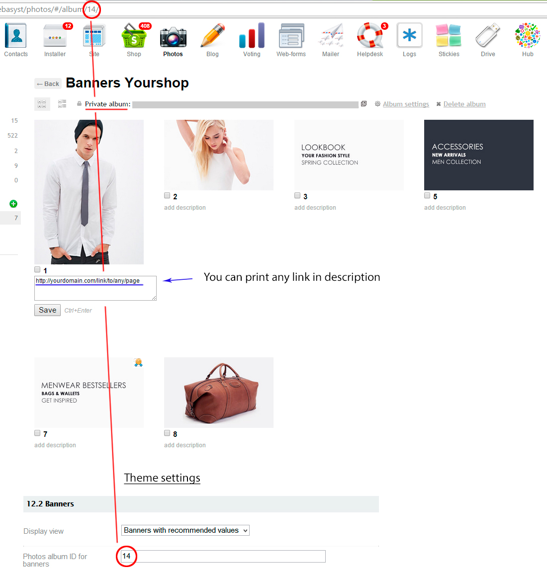
You can specify the link in the description of image.
Category badges

In horizontal menu of categories and in the categories tree in sidebar you can use badges for any category. You need to use "Additional parameters" in category settings.
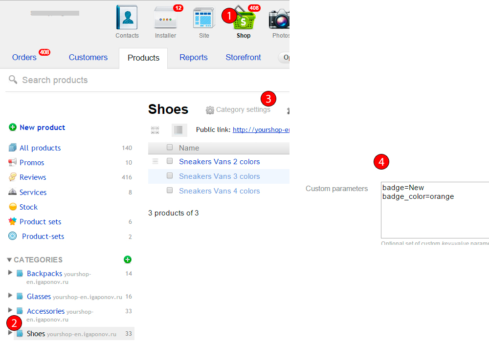
Additional parameters:
- badge - text of badge;
- badge_color - background color of badge. One from available (orange, crimson, yellow, olive, lime, lilac, teal, coral, graphite, aubergine);
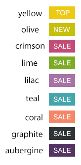
- badge_color_hex - background color of badge in HEX-format. Example, #ff0000;
- badge_text_color - color of badge text in HEX-format. Example, #ffffff.
Display of product skus
There are 3 types of display of product skus on product page:
- List

- Dropdown list

- Inline
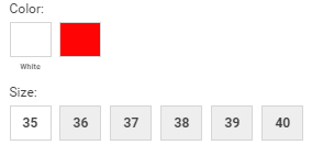
For "List" display go to "Edit" of product then to the "Basics". Find "Pricing & availability" and check "Purchase options".
If you check "Selectable parameters", the display will depend on your Theme settings - Selectable features.
Also you can use "Additional parameter" selectable_features for individual display of product skus.
Available values
- select - dropdown display
- inline - inline display
For individual display you need:
- Go to product page (click "Edit")
- Open "Description & SEO"
- At the bottom in "Additional parameters" of product specify the value you need.

News block
News images (preview)
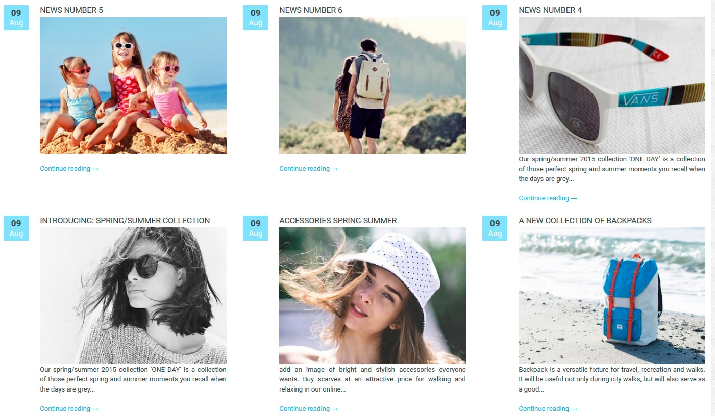
You can set preview images to each post in the main page of the Shop:
- Go to Blog
- Click on the post you need
- Find "Meta" on the right sidebar, click "edit", in the "Custom parameters" specify preview, which has to contain absolute path to the preview image.
Example:
preview=http://mydomain.ru/wa-data/public/shop/themes/some_images/myimage.jpg
- Click Save
Don't upload large photos, use width 250px.
You can upload photos in the Site-Files
External link to website/blog
If you would like your news go to some other website or blog, you can use one more parameter external_link, which should contain link to external website. Don't forget to specify http:// or https://.
Example:
external_link=http://goaway.ru/
Footer
Footer has 3 blocks:
- Information columns.
- Subscribe form.
- Block with the information of your shop. Can be changed in Theme settings.


